intebee.com
 intebee.com
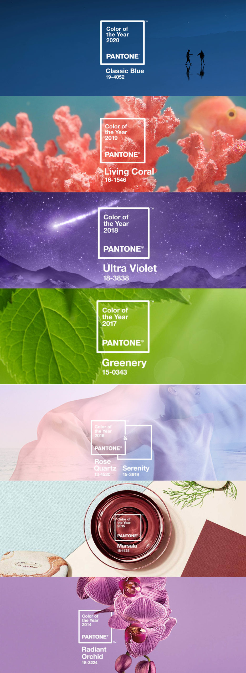
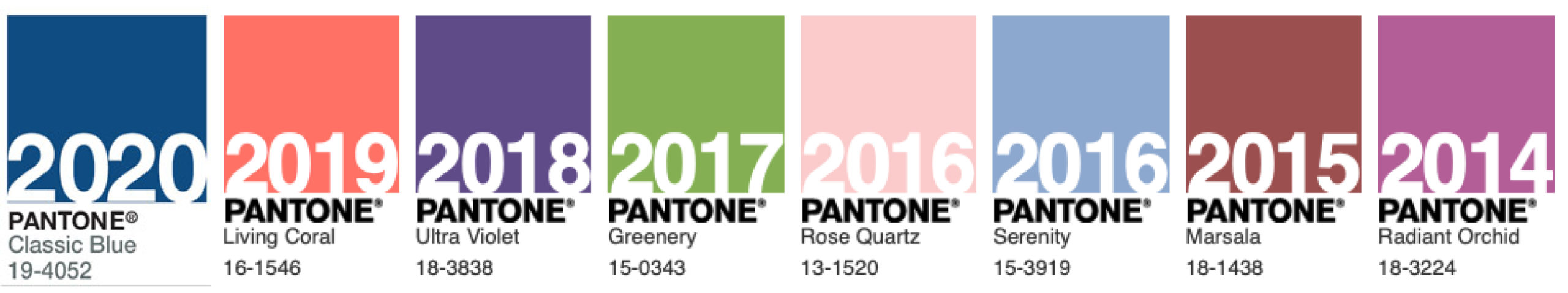
2020年のパントンカラーオブザイヤーは“Classic Blue(19-4052)”

パントンによるとこの色は「落着き」「自信」「繋がり」を表し、新しい時代へと進む私たちが望むような信頼できる安定した土台を表すという。
一方、2019年の色はサンゴのピンク色だった。テクノロジーとソーシャルメディアによって日々変動し続ける世の中で、優しく人々を元気付け、豊かさと温かさを与える色とされた。
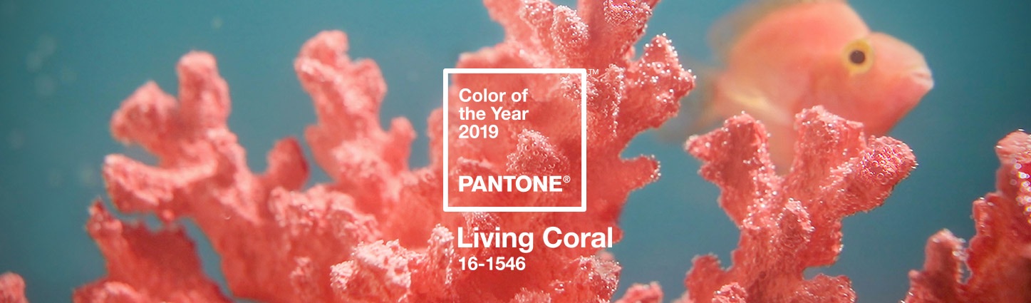
柔らかいピンク色から、深い青色への変化。暖かく活動的な2019年から一転して、深く鋭く思考することがテーマとなる2020年となるのかもしれない。
2019・2020年のプロジェクトではないけれど、これら青とピンクを使った過去の記事を紹介します。
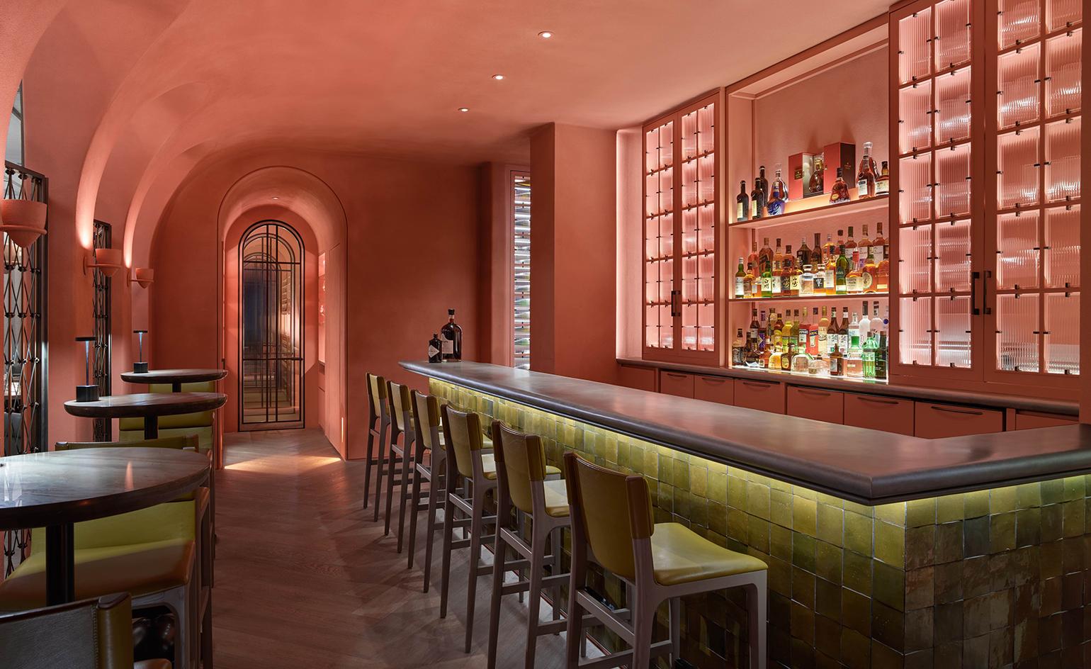
11 Howard Hotel | Design Article – INTEBEE
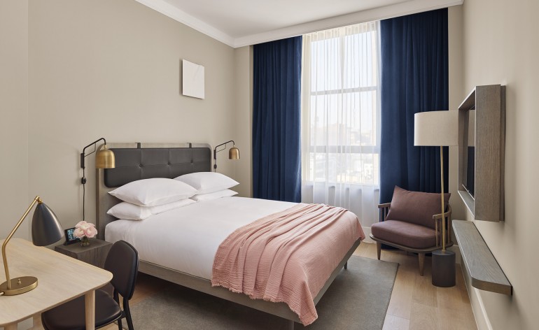
– 2016 opened – Located in SOHO, NY – Hotel by Aby Rosen, Creative Direction by Anda Andrei – 221 rooms – Soft tone materials with contrast – marble, wood, leather, plaster, porcelain tiles, or brass trim. – Fly collection from &Tradition – Ren collection from Stellar Works – Space Copenhagen designed furniture from Mater, Stellar Works, &Tradition, Gubi, and Fredericia – Modern Scandinavian design. Classic luxury with modern industrial accents. Carefully balanced contrast. – Home rather than hotel room – “We’re really interested in materials – stone, woods, leathers. We love things that age well. It’s part of our responsibility that a project lives on in a beautiful manner long after we’ve left. –SPACE Copenhagen Co-founder, Signe Bindslev Henriksen” – Artistic space with light and shadow but not away from residential feeling – Bar called The Blonde Photo from 11Howard Hotel
Arbor | Design Article – INTEBEE
Arbor is located in – 25th floor of H QUEEN’S by Architect CL3. They offers innovative and quality Michelin start French fine-dining by chefs Nicolas Boutin and Eric Räty at the helm. The space offers warm relaxation and refined home feeling, but it’s also creative and cultural based on classic French home design. It offers the perfect place to escape from battle of Central, Hong Kong. Pink, Blue, Green and Cream colors in tranquil tones and painting of the wood on wall makes fun but highly sophisticated feeling. Photography from : Interior Design ; Yabu Pushelberg website, Virgile Simon Bertrand / Architecture : CL3 website
下は2014年から2020年までのパントン カラー・オブ・ザ・イヤーの移り変わりをまとめました。

- その他 -
参考Website https://www.pantone.com/color-intelligence/color-of-the-year/color-of-the-year-2020
リンク先詳細:
Pantone Color of the Year 2020
– All Images –